This month for our book selection, Andrew Thornton chose “The Bucolic Plague” by Josh Kilmer-Purcell. The real life tale of 2 Manhattan executives who became… goat farmers. I had heard of Josh and Brent as they starred in a reality show “The Fabulous Beekman Boys” depicting the cycle of growth and chaos on the farm. Raising heirloom vegetables, parenting a diva llama and a herd of adorable goats, and creating “Beekman 1802” their line of goats milk based bath & beauty products – all taking place on the former Beekman estate in upstate New York. They also ran… and won… “The Amazing Race”! Quite a multi faceted pair, these two…
The book was a fast and engaging yarn. Josh tells their tales, all the ups and downs, with honesty and humor. I dare anyone to read the scene about the baby goats in the truck on the way to the Martha Stewart Show – and NOT be compelled to read the rest! It was heartfelt in the telling of the trials and tribulations of this dream turned reality, and didnt candy coat the all too real stresses that this journey put upon the partners. I applaud that honesty, and was all the more engaged; feeling I was allowed to see the real deal. As someone who left a full time lucrative (art) teaching career at its prime to allow myself to be a full time artist – I respect and admire their risks taken and rewards reaped.
I was struck most by the contrasts in the book and the attempts to reach compromise, middle ground and a general sense of balance. And this was an evolving journey, with no clear solution – just 2 loving, inspired, creative, energetic, daring adults trying to make a dream a reality. And a life for themselves, and then some…
From the city to the country. And back to the city.
From close partners to long distance partners, working partners…
The polar opposites of Martha Stewart’s Stepford-like perfection to Oprah’s “Best life” with a dash of Wabi sabi.
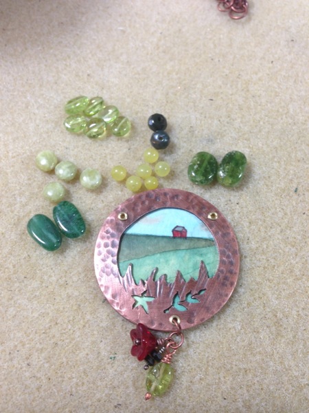
“Country” – Hand painted watercolor, under mica; with gems. Inspired by the goat barn, and the grassy border of the “Beekman 1802” logo. (Shown below).
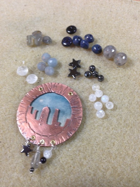
“City” – watercolor sky behind a copper NYC skyline; with gems.
*Disclaimer -I designed this piece to be two sided. Country/city pendant… and I drilled the holes incorrectly. Jeez. Embarassed. As I thought it over – trouble shoot or do 2 pieces? Inspiration struck…)
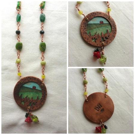
The finished “Country ” piece – the copper backing is stamped with “Best Life” typos and all. I wanted to pay homage to the idea of doing what you love, doing what makes you happiest – even if its not perfect or always pretty.
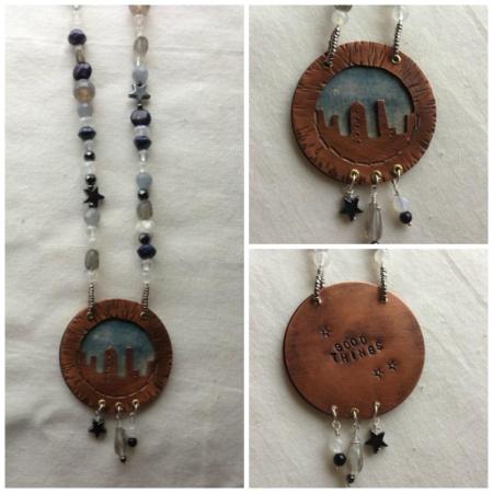
The finished “City” piece. “Good things” come in all shapes and sizes… and should be appreciated, honored, and recognized. The city became a bit of a necessary evil to Josh as he spent weeks working to financially support the farm/his dream, while Brent was doing the day to day… yet it was Martha’s own “good things” that helped launch the soap business initially.
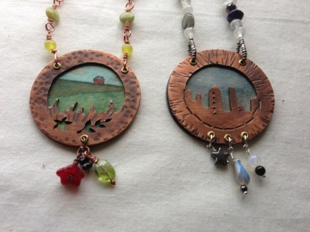
But this story wouldnt have occurred without both sides of the tale, both people, both environments. A sense of contrast and a sense of balance achieved!
Congrats to Brent and Josh at their upcoming wedding at the infamous Beekman Farm!
Please take a look at my friends and colleagues’ offerings this month! The full list will be posted on Andrew’s blog.
Thank you for stopping by – I would love to hear what you think!

I love both of your pieces…especially the “Country” one with all its greens and the little water colored barn. I’m impressed with I think they might actually work better separately… maybe your drilling mishap was a happy accident!
In any case, I’m impressed with the copper work you did on both focals. Lovely!
LikeLike
Thanks Sarajo – It surely freed up my color palette! If it had been one focal I was feeling compelled to keep it nuetral. I was pleased to do 2 and play up the colors with… gems. More gems!
LikeLike
I haven’t read the book, but I like the idea of balance and contrast that you achieved in your pendants and description of the book. Finding the good things that make you feel whole and balanced is an important and evolving quest.
LikeLike
Linda – its a great read, very engaging, yet rather quick I highly recommend it. Nothing like following a wild hare and making a dream a reality. Sure – htey had connections in their business ventures, but they pulled it off with charm and grace under pressure. And their bath and body products look really scrumptious. I may have to splurge.
LikeLike
I think you did a great job of illustrating the contrast reflected in the book. I gave thought to doing something that reflected the Martha Stewart/ Ophrah contrast in the two personalities of the Beekman Boys. But it was just a thought. You made it a reality,
LikeLike
Thanks Mary – it was what spoke to me the loudest. There were really cute goats – but thats not my jewelry aethetic! HA. I respect both the Martha and the Oprah philosophies and think there are important messages to hear in each one.
LikeLike
Wow, Jenny!
Great interpretation! I love the contrast of the city and country. Your copper work is inspiring!
LikeLike
I absolutely love what you did here…and I will have to read the book too! I just recently kept a fortune cookie paper that said the best things happen to those that take risks…I’ve pretty much run my life that way and have always been crazy happy…so glad you are too!! Love the way you incorporated your watercolors with the copper…very cool and inspiring!
LikeLike
Fortune smiles on the brave…. Thank you! And I think that fortune cookie slip may have to be framed as a pendant too – dont you think? Break in the new studio with intention and good juju!
LikeLike
Love both of these necklaces!! Would love to get some similar focals. Think they would be a hit!
LikeLike
Both pieces are beautiful, Jenny! I think you’ve done a really wonderful job. I love the little watercolors and the decorative frames that incorporate more thematic symbolism.
I think one of the reasons that this book was so popular amongst our group is that it was very easy to relate to. Even if you’re not exactly sharing the same experiences as them, there’s a kernel truth in the writing that’s almost universal. We all have hopes and desires and dreams… and I think the author did a nice job at capturing that.
Thanks so much for participating and creating such lovely pieces! They’re AWESOME!
LikeLike
Andrew – I agree. The book was written in such a way as to be very real, honest and accessible. Very open – so we feel we have really met Josh and Brent. That is special – to be let into their lives to that degree.
LikeLike
Jenny,
I enjoyed your well written review of the book. Your pendants are beautiful. I love your inspiration of contrasts and opposites.
LikeLike
Thnak you Jeanne – I was a bit frustrated that I couldnt pull off a double sided pendant. There wasnt time to re-do… But it was my feeling at books end – of the balance and integration of opposites.
LikeLike